The New AI Aesthetic
You may not expect to find evidence of our changing relationship with AI in the Facebook group for your local village, but increasingly that’s exactly where it’s showing up.
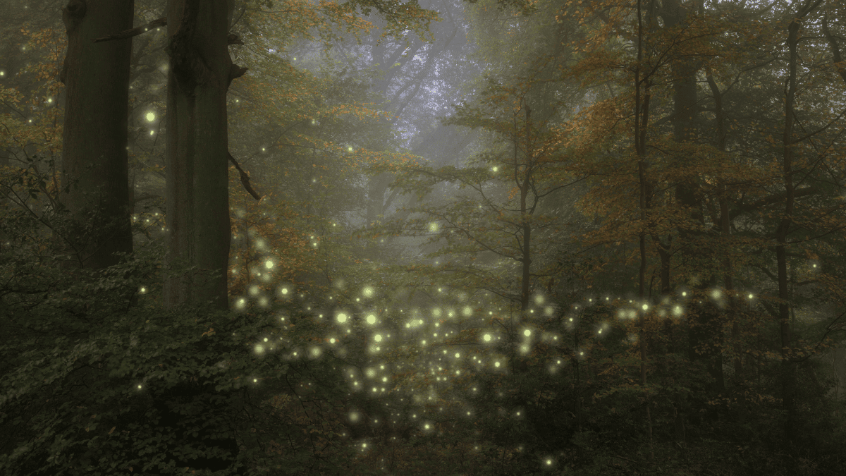
Church fundraisers, toddler groups, school events and village fêtes are being promoted with colourful, highly polished AI imagery that would have looked remarkably futuristic only a couple of years ago. Now it’s everywhere, and increasingly it all looks strangely familiar. The colours are bright, the people impossibly cheerful and the lighting often strangely cinematic, with balloons, flowers, bunting and occasionally a slightly questionable number of fingers thrown in for good measure.
A toddler group and a church fundraiser can somehow look as though they take place in the same magical AI-generated universe. And perhaps we’re reaching the point where the novelty is beginning to wear off.
When Everyone Gets The Same Tools
It’s not difficult to understand how we got here. Community groups usually have small budgets, limited time and no graphic designer waiting to create their next Facebook post, while tools such as Canva have put increasingly sophisticated design and AI capabilities into software that almost anyone can use.
Suddenly, you don’t need much design experience to create something that looks impressive. Describe what you want and within seconds you can have something colourful, detailed and polished enough to stick on Facebook, but having access to the tools of a designer isn’t quite the same as having a designer’s eye.
Part of good design has always been knowing what to leave out, as well as noticing when something is too busy, when an image doesn’t quite fit the organisation using it or when one more effect isn’t going to make something better. AI can make the execution incredibly easy, but it doesn’t necessarily provide the judgement that comes before someone decides: yes, that’s actually good.
The WordArt Problem
There’s something about all this that feels slightly reminiscent of the early days of WordArt, when suddenly everyone had access to shadows, gradients, curves, outlines and 3D text. The fact that we could use all of them inevitably meant that quite often we did, whether the school newsletter really needed a rainbow-coloured arched headline with a drop shadow or not.
AI image generation feels as though it may be going through a similar phase. If you can make your summer fête poster brighter, more elaborate and more cinematic, why wouldn’t you? If the AI offers you smiling families, perfect sunshine, bunting and a field of wildflowers, it’s very easy to look at the result and think: Yep, that’ll do.
But the ease of creating the image also makes it easy to skip the bit where someone looks at it properly. Hands can still be wrong, background writing can be nonsense and people can occasionally look not quite like people, but there are also less obvious questions about whether the image actually suits the event, organisation or community it’s supposed to represent. As the tools become easier to use, that kind of judgement arguably becomes more important rather than less.
When Polished Stops Standing Out
We’re also becoming remarkably good at recognising the aesthetic, because what initially looked clever and novel starts to feel generic once you’ve seen versions of it on a school disco, charity coffee morning, local restaurant menu and village fête. There’s already pushback against that look, particularly among designers watching the same visual patterns appear again and again.
The irony is that AI-generated imagery can be technically more accomplished than the homemade posters it replaces while still somehow feeling less distinctive. The old versions might have had mismatched fonts, slightly blurry photographs and far too much information squeezed onto the page, but those imperfections often gave them an identity that felt specific to the school, church or community group behind them.
Once enough people have access to the same capabilities, the things that initially made AI imagery stand out can quickly become the things that make it blend in. Something can be polished, colourful and technically impressive without necessarily being particularly memorable.
The New AI Aesthetic
AI has made it incredibly easy to create something that looks polished, but that creates a new problem: when everyone can do it, polished stops standing out. What matters then is the judgement that comes afterwards; looking properly at what the AI has produced, questioning it, stripping things back and deciding whether it actually feels right rather than accepting it because it looks impressive at first glance.
That doesn’t mean returning to terrible clipart and rainbow WordArt for the sake of proving a human made something. But as more of our feeds fill with the same bright, glossy AI aesthetic, the slightly wonky, unmistakably human poster may eventually become the one that stands out.
Image sources
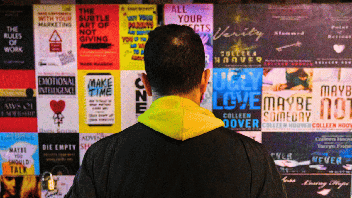
- person standing infront poster-1200: ©Amr El Hadeka from Studio Egypt via Canva.com